December 17, 2008

Lounge


Pink is not a colour one sees often in a lounge but this shade brings out the best in this room.
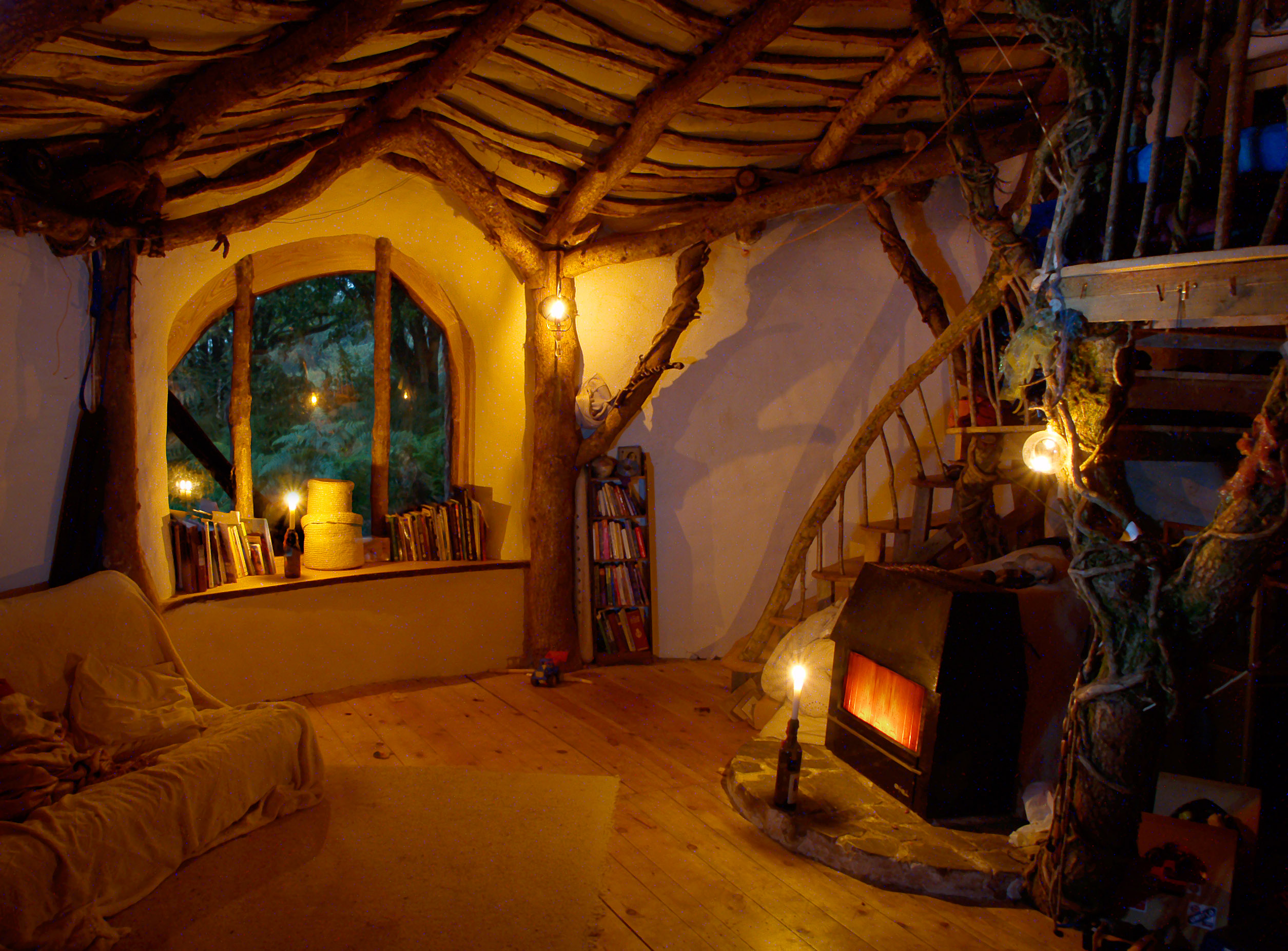
Notice the alcoves, wooden shutters and accents, windows, spiral staircase and the overall rustic lived-in look makes this a charming, unpretentious space.


Subscribe Today!

December 11, 2008

Lounge


If you have a lounge which needs brightening up and you are finding it difficult to come up with a colour scheme which you can live with and easily alter later, then you could start with: white, blue and yellow.
This lounge is easy to live with, fresh and adaptable. Notice how one area is painted a more vibrant color and stands out from the rest of the room without overpowering it.
This would work especially well if you had a large open plan area which you needed to divide without spending a fortune. The wall could be substituted with wall panelling or wooden room dividers which could be painted or decorated to your own taste.
Add accessories slowly - rushing out and trying to fill spaces usually end up being costly mistakes. Live in your empty space for a while and then decide on pieces because you love them, not because they are in fashion or your neighbour has one.

Window dressing is also important. If you are looking for a clean, fresh look them adding flouncy curtains won't do. Blinds which blend into the wall are discreet and easy to maintain - no major washing and pressing of fabric curtains.
I will be doing a post on window dressing shortly so watch this space!

Room designed by Gunkelmans.com - visit them for other great interiors.

Are You a Follower of this Blog?

December 5, 2008

Doors


This double door set within an adobe framework and leading from the outside into a courtyard is part of my fascination regarding doors. Old doors in particular. The newer lighter weight doors are clearly more practical and cost much less as they are mass produced.
My doors, the doors that I cannot stop gazing at or touching(!), are those which have been at least hand finished by craftspeople who love their work. Oh, those images of people lovingly making these works of art just won't go away!

Are you fascinated by old wooden doors?


Subscribe Today!

November 29, 2008

Bedroom


This twin bedroom is somewhere most people wouldn't mind waking up in. I love this room for its old-fashioned simplicity. The wallpaper harks back to yesteryear without being overpowering.

The room is fairly easy to recreate. The walls could be painted apple-white instead of using wallpaper and if you have an old wooden bedstead it could be brought back to life with a coat of hard-wearing paint - if it has seen better days and had a few knocks all the better.

Subscribe Today!

November 26, 2008

Fireplace


Kiva fireplaces are just adorable. It reminds me of my short stay with friends a few winters ago in Mexico. We spent many evenings sat round the Kiva fireplace with homemade margarita's and tapas sharing awful jokes! My friend had a home where  you had to kick off your shoes and put your feet up and explore the fridge yourself if you wanted a snack. Great fun.

I love Kiva fires because they are usually in unpretentious homes. The kind of homes where it doesn't matter if you happen to spill things or leave a few items strewn around - makes it look more homely.

These fires really do work and they are usually tucked away in a corner of the room and so tend not to overwhelm spaces yet they look wonderful too. Apparently the fireplace is quite weighty and so you would need to ensure you have solid floor foundations. If in doubt get expert advice before trying to install one yourself, which could be done without too much fuss.

Do you like these fireplaces as much as I do? Or maybe you have one - tell us what you like/dislike about them.

November 24, 2008

Shower


Only one phrase: Simple decadence.

See more beautiful interiors at studioluxe.com

Subscribe to this Blog Today or be a Follower!

November 23, 2008

Kitchen


A wooden kitchen cannot be beaten in terms of the look and feel of wood. Here the owners of this kitchen have exhibited their love of wood in the sink, the drawers, the worktops and accessories.

If you are buying wood do try and ensure it is eco-friendly, i.e. from renewable sources and not hardwood from the rainforests. There are so many eco-sources available now so we have no excuse.

This kitchen would suit a small space where a 'wow factor' was required without spending a fortune. If you have a larger space then this could be the spare sink in the corner or in a utility room. I think it is always preferable to have a double sink as I find them much more practical but it is all a matter of taste and space.

Be a Follower! - see the left hand column.

November 19, 2008

Bathroom


Is this not the ultimate luxurious bathroom?

Imagine a cold wintery day and you arrive home after a hard day of work and have the ability to sink into a bath of warm silky bubbles with a glass of wine in front of the glowing embers of the fire.

Bliss!

Subscribe Today!

November 18, 2008

Garden


This garden is special and yet is easy to manage. The outdoor space has been split into an area for seating and entertaining and also a fountain area surrounded by a mass of foliage and soothing, scented plants. 

You could recreate something similar, even without the fountain, in your own garden. Keep it simple. Consider your particular garden and the amount of sunlight it receives at different times of the day and seasons. Don't be afraid to add large planters as features but start with a few items and then build up gradually. 

Visit the garden nurseries and find plants that you like and that will do well in the soil you currently have. I try to ensure easy-to-care for items are top of my list in my garden, but there is no point in having plants which are easy yet won't grow in your garden.

This garden makes for a wonderful space for outdoor living - wouldn't you agree?

November 17, 2008

Lanterns


If you are trying to brighten up your home without too much expense then why not add Moroccan-style lanterns to your home. The brighter the better! Consider the decor in your chosen room and focus on a toning or contrasting colour to add a splash of zing.

A friend of mine has a 'snug' room where she has seven lanterns in various places around the room, a huge squashy sofa, pouffes, soft rugs and a multitude of cushions all around a low ornate wooden coffee table. The colours all clash and meld together wonderfully and I have attended her gatherings where 10 of us are all slouched in the intimate space,  enjoying strong mint tea, snacks from the Middle East and North Africa and great conversations. These lanterns remind me of and prompted me to highlight how wonderful lanterns can be when used boldly. Unfortunately, she is a perfectionist and refused to allow me to take pictures of her great space as she is not happy with the wall colours and is in the midst of choosing new colours.

Safety tip: Lanterns with scented candles also add to the ambience but choose carefully and ensure they are safe for your particular lantern in terms of size, height, etc. Oh, and don't leave lighted candles unattended.

November 16, 2008

Chair and Stool


If you are looking for quiet kitsch then look no further! You may not like the cover design but imagine them in a burnished leather in an unusual colour. Or with  legs stained dark.

If you happen to see a classic or old unusual chair or stool don't focus on what it is but on what it could be. 

I love this style and think it would fit in well with a plain room which required a little bit of zing to finish it off. Don't forget this set offers comfort and style. See more chairs, sofas and stools like this at Conran.com or at my perennial favorites, the thrift stores, yard sales or even Craig's List and classified ads. They are out there and you can save thousands of dollars and personalise them to your own decor and taste with a new covers.


Subscribe Today!

November 15, 2008

Stairs


Spiral staircases are usually installed in  areas where it is difficult to access an upper floor without too much cost and upheaval. Often times these staircases are in various forms of metal which can infringe ones modesty if wearing a short skirt whilst ascending or descending! Plus so many metal spiral staircases I have experienced are badly constructed and feel unstable whilst in use.

This enclosed version looks modern, sturdy and yet makes a design statement on any room - regardless of how short your skirt is!

What do you think?

Subscribe Today!

November 13, 2008

Mirror


Mirrors can make or break a room. They have to not only look good and serve a purpose but should be placed with care. This mirror totally ticks the boxes on all fronts. It doesn't overwhelm its surroundings, yet blends in perfectly well. It has a stylish 'art deco' feel to it and although expensive, not extravagantly so.
Graham and Green have been established for years and are a company based in England yet provide inspiration for home decorators, large and small, from around the world.

A great mirror. Have a look at their other products - you may just be pleasantly surprised.

Subscribe Today!

November 12, 2008

Dining


With USA readers soon to be celebrating Thanksgiving and Christmas (for those who partake) around the corner, there are many reasons to check you have the right number of crockery items for all your guests.
If you are starting from scratch, the best option is to go for simple white crockery. Usually visiting thrift shops, dollar and charity stores or large supermarkets or discount stores can unearth some real bargains.
Find fabrics shops: think sari fabrics, velvets, ticking or crushed linen.

Choose plates that are larger than you would normally use and they can be used as dinner plates and double as serving plates too. Don't restrict yourself to round plates - if there are square, oval or anything else consider them too.

If you are wary of buying all white china then add colour with your table dressing. Think candles, table runners, flower arrangements (remember to keep them low and not obscuring your guests line of sight), serviettes, tea lights,table cloths and so on. Don't forget that most higher-class restaurant establishments use white china to showcase their meals - mainly because it looks nicer!

Don't fuss too much at your dinner party. Your guests want to enjoy you and your company and a host who is fussing around, worrying about every aspect makes others feel ill-at-ease.

In these days of financial restraint if you are buying many items don't forget to ask nicely for a discount - start at 20% and see how you do.


Have you Subscribed?

November 9, 2008

Bed


Okay, I admit it! My favorite rooms are the lounge, kitchen and the bedroom. In my honest opinion those are the ones I tend to focus on most.

This bed is wacky and fun and maybe a little on the expensive side at $15,000. This is not a bed I would like for myself but it still makes me smile.

If you like it then pop over to Shawn Lovell Metalworks at www.slmetalworks.com - plus they have many more interesting items for sale.

November 8, 2008

Chair


This is a rare Marc Newson chair sold in Sydney, Australia for $3500. A seriously cookie design and a design classic. What do you think?

Subscribe Today!

November 7, 2008

Sink


This sink is amazingly simple. Definitely for a modern home and obviously a talking point if you ever needed one!
Villeroy and Boch have a whole range of household fixtures and fittings which are beautifully designed. I especially like their timeless products from crockery to rugs.

Oh, and don't forget: I post about products I like without payments or inducements from the aforementioned companies.


Have you considered being a 'Follower' of this blog?

November 2, 2008

Lounge


If you are looking for someone to help you redesign your home then robinbelldesign.com have a knack of making a jaded room come alive.

I have been following their work for a while and think they do a wonderful job - case in point the room above. Mixing new and old they ensure this lounge has a comfortable, warm feel. The large leather stool, the overstuffed sofa, the very practical coffee-table and the restrained yellow on the walls create a beautiful space.

Please Note: This blog is 'Pay-Per-Post-Free' and therefore no payments, inducements or otherwise are included nor received in any blogposts. Read in confidence that any ideas, suggestions or companies discussed or featured are here because I like them or think they have something to offer you - namely quality, design and/or good value.

Subscribe Today!

Image Reproduced with permission from the Robin Bell. Further reproduction prohibited without the express written permission of the Robin Bell

November 1, 2008

Lounge


I'm a big fan of fresh, bright and stylish rooms and this is one room that I could live in quite easily. 

The room is framed by a simple arch where the owners have used restraint and considered pieces to bring a modern yet eclectic feel to the room. Very effective.

Subscribe Today!

October 31, 2008

Bathroom


Usually I am not a fan of heavily themed rooms and this bath does not seem overly large  - yet there is something about this bathroom which makes one imagine relaxing in the candle-lit environment at night with a nice glass of wine and good company!

The view in the daytime must be a sight for sore eyes. The wooden flooring, light white drapes and a rustic ceiling make for a great space.

Have you considered being a Follower of this blog? 

October 28, 2008

Dining Room


In my previous home I was determined to rid the house of the deep dark depressing brown flocked wallpaper and gloss paint. As soon as I could I painted 3 layers of a warm white on all the walls and ceilings. The dining room came alive and after a lot of hard work managed to sell the property for a tidy profit.

This dining room reminds me very much of my previous home. Notice the great mass of storage space which manages to blend into the decor. Great space to store all your requirements for dining ware -  away from the kitchen.

The candelabra adds a special touch which doesn't seem out of place in this setting.

The padded dining chairs essential -matching comfort and style. The large rug demarcates areas wonderfully.

A great idea is to paint variations of white in different rooms or areas. White can seem and feel cold, especially when the temperature drops and good lighting, 'warming' accessories and proper placing of furniture in the room will ensure your diners focus on the ambience, good food and company. As the night draws in good quality scented candles can add a special something: flickers of light and a great smell.

Overall a great space, wouldn't you agree?

October 27, 2008

Lounge


This Manhattan apartment has a hint of retro and yet is stylish and warm. An apartment for a busy person who is style-conscious but not overly so. The furniture almost appears thrown together, yet an artful eye has carefully chosen these items although I'm not too sure about the wall art.

What do you think?

Subscribe Today!

October 24, 2008

Door


This hacienda door is an example of a doorway making a bold statement. Of course, the house itself must be equally as commanding.

Solidly built and the porch acts as a great lead to the door (the side areas resembling a portcullis) and into the great house.

Subscribe Today or be a Follower!

October 23, 2008

Lounge


This lounge is spacious and quite large yet manages, through effective zoning, to look cosy and inviting.

The focus here is on natural, neutral colours that are easy on the eye and aids relaxation. The sofas are large and are ones you could easily curl up on. A warming, attractive working fireplace is a lovely feature. 

The dining area has a lower ceiling  - much more intimate. 

Expanses of windows enables natural light to enter the room. Choice pieces of art, furniture, lighting  and accessories are restrained and are not allowed to overwhelm the space. 

Subscribe Today!

October 22, 2008

Bedroom


The view makes this room.

Adding colour to jazz it up to your own tastes would be quite inexpensive. The openness and minimal look lends itself to restful sleep and space to move around comfortably. Clean lines abound and great lighting adds to the overall look.

Have you considered being a Follower of this blog? 

October 20, 2008

Hallway


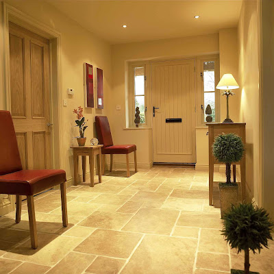
A hallway is the second stage after the front door. Your hallway is an entree to the rest of your home and so first impressions count. Clear away clutter.

Consider where you store your outdoor clothing and accessories. Do you have an unobtrusive space to store your shoes/boots? 

If your hallway is small it is a good idea to utilize color to create a sense of space. Or you may want to throw away conventional ideas and paint vivid bold colors which will match the rest of your home. Do what feels right to you and should you choose a colour you later dislike, the great thing about a small space is it is easy and relatively inexpensive to change.

Try to install hard-wearing flooring and choose a large internal doormat to prevent any outdoor debris being trampled through the home.

This hallway is obviously part of a large home but could be adapted to fit a smaller hallway. Add a chair or a small table. Make each piece as beautiful as possible as these pieces will be seen each time you leave and enter your home - let your hallway represent you.  

Subscribe Today!

October 16, 2008

Chair


Here is a great way of covering a chair which, although sturdy, may have seen better days. If you have a sewing machine and have basic sewing skills then this should be considered in the 'very easy' category. Just remember the old maxim 'measure twice and cut once'.

Consider your decor and use fabrics which tone and are hard-wearing. 

I think this simple enhancement would add much to any home - wouldn't you agree?

Have you thought about being a FOLLOWER of HouseHomeGarden? 

October 14, 2008

Bedroom


This bedroom is so-oo romantic - even as a guest bedroom. Aim to keep the emphasis on subtlety. 600-thread Egyptian cotton bedding, vintage cotton bedlinen, comforters - all add to the physical comfort.

The matching mirrors could be replaced by co-ordinating works of art. Work with what you have currently and use imagination to improve a key piece of furniture you already have. Ensure you have sufficient light in the room, if not, then use artificial lighting to create an ambience of coziness. 

A great place to snuggle down and read a good book. A great space to wake up in!

October 13, 2008

Update: Free Banner Offer

Thank you to everyone who responded to my offer to create a 125 x 125 banner for free. I have succeeded in creating banners that people like and enjoy and failed with a couple!

Altogether I designed 11 banners and get a real kick out of seeing them on the different blogs and websites. I hope the majority of you liked your banners!

Along with the successes there must come failure... I have been unable to create a banner for The Little House in the Suburbs - this is because the banner that exists already is a good one and I could not better it. Sorry! But I will keep this banner on my site for 30 days as consolation for being unable to produce the goods  - I did try though!

I am thinking of doing something similar again before Xmas  - maybe you might need a Christmas-y theme for use short term over the festive period. If you do then get your ideas together, images, fonts, etc. and visit this blog for further notification some time in the near future. 

Thank you again - I had a lot of fun working on these banners!

Subscribe Today!

October 11, 2008

Bathroom


I really enjoy Robin Bell Design. Bold, traditional yet with a twist.  This bathroom can be replicated on a far lesser scale to good effect. I am a fan of thrift shops, especially in these constrained times, and relish finding an old mirror which needs a little TLC; an old table which could be painted to blend or contrast with my decor. 

Choose your pieces carefully - don't rush to try and bring the whole look together as could it appear a little contrived.

Alternatively you could contact Robin Bell Design and have them weave their magic in your bathroom or any other part of your home.

Remember I do not participate in pay-per-post type programmes and therefore anything you read within these posts are my own genuine recommendations for which I gain no financial benefits and I intend to keep it that way! Read with Confidence!

Subscribe Today!

October 9, 2008

Lifesaver

Everyone I know currently has one eye on what is happening regarding global economics and it is easy to forget essentials at home. Do you have a smoke detector/fire alarm? If you do, when did you last check it was working properly, change the batteries?

If you don't have one I suggest that you read the guidelines below and purchase the required number of units for your acommodation - place on your 'priority purchase' list.

There are many types on the market and you might find it useful to search your local area or the internet for reliable ones which have great reviews regarding their performance.

Once you have installed your smoke detector(s) it is important to follow these guidelines in order to keep you and your loved ones safe.

The cost of a smoke detector may seem expensive if you are on a tight budget, but not if it saves you and your family from injury or even worse. Just imagine the trauma, expense and inconvenience of a fire occurring in your home to which you have not been alerted quickly enough. 

A serious must-have item for people who understand the devastating effects fires can have.

Subscribe Today! 

Remember I do not participate in pay-per-post type programmes and therefore anything you read within these posts are my own genuine recommendations for which I gain no financial benefits and I intend to keep it that way! Read with Confidence!

October 8, 2008

Patio

For some of us the colder winters are drawing in but for those in warmer climes this might be the perfect time to organise your outdoor space. This patio uses a warm terracotta colour and ensures that a variety of tones and textures are used throughout with a dash of white. 

Add hardy plants which suit their positioning and require little attention although try not to drown the area with plants - choose carefully - less is more here!

If your local weather conditions include much rain then change the roof cover to a solid, waterproof material - ensuring you can relax outdoors in most weather conditions without getting wet. Consider the amount of overhang you would require - a larger overhang gives more coverage to the space beneath it.

A beautiful space! Wouldn't you agree?

Subscribe Today!

October 6, 2008

Quilt


If you live in the Northern Hemisphere and 'enjoy' cold winters then what could be more impressive currently than to have a hand-made quilt gracing your bed and keeping you warm on a chilly night.

Quilts last for generations and are considered of great sentimental value and heirlooms passed on through families. 

If you are new to quilting then it is advisable to start small, a cushion is a good item to start with. Ensure you have gathered the right tools: needles, thimbles, sharp scissors/shears, thread, iron, ironing board, sleeve board, etc.

There are so many retailers and artisans selling beautiful handmade quilts, even antique quilts and innumerable resources available on the internet to enable you to create a beautiful work of art.

Now there's an idea: Creating a patchwork quilt for the winter! (or buying!)

Subscribe Today!

October 5, 2008

Bedroom


Looking to change your bedroom without spending a fortune? This bedroom is simple yet won't break the bank trying to recreate it. Skip the wood panelling on the walls and instead paint the walls a cool calm colour. If you have a metal beadstead that has seen better days consider priming and spray painting to give it a fresh look.

Your nightstands, or bedside tables can be made simply from wooden or chipboard/plywood covered with co-ordinating fabric or painted with hardwearing paints.

Bedside lighting is important and free-standing lights tend to be more versatile than ones fixed to the wall. Lampshades are important and a bedroom requires softened light yet still bright enough to enable you to read comfortably.

Choose a main colour and add accessories to enhance the look of the whole room. Try thrift shops for old, vintage-type fabrics and make a few cushions to match for the bed. A handmade quilt can be all it takes to add that je ne sais quoi. 

Have you considered Subscribing Today! See the top right hand column for more information.

October 2, 2008

Chair


Classic styles never go out of fashion and this chair falls into that category. A chair that makes a statement in any colour yet combines elegance, beauty and padded comfort. Timeless.

Subscribe Today!

September 26, 2008

Kitchen


Have you ever imagined a kitchen with a chandelier in it? Somehow this doesn't look out of place. The setting is grand without being over-the-top. (Don't forget the ceiling artwork!)

Streamlined kitchen space for a serious cook who likes to have a bit of fun. 

Subscribe Today!

September 21, 2008

Lounge


This lounge gives the impression of being able to change around in a jiffy. A simple room which lends itself to change and adaptation. A cottage-y, cosy feel, especially lends itself well to small rooms - you may care for bolder colours, but try not to overwhelm a small space.

You may notice that the furniture is a mix and match of different styles. If your budget is small then consider purchasing used furniture that is well made - if purchasing wooden items then check for and avoid woodworm or other deficiencies. If your intended seating purchase is upholstered then look beyond shabby covers and try to imagine of your ideal covers and consider having a good upholsterer work magic on the item(s).

Thought about Subscribing Today?

September 15, 2008

Lounge

Here's a variation on the white lounge from the previous post for those you wary of spoiling the look (all white) with everyday thrills and spills.
This room is still beautiful and more practical in a sense. A room for the family where a few scuffs actually add to the relaxed combinations. High ceilings, wooden floors and simple accessories and a mix of comfortable sofas and chairs. Again a great room to relax in. Sigh.....!!


[Remember: Click to expand all images in posts]


Subscribe Today!

September 14, 2008

Lounge


I know that living in a white room isn't the most practical if you have young children and don't want to worry about every stain but...it does look beautiful and is so wonderful at night. Especially if you light scented candles. The key to ensure you don't spend your life cleaning is to have removeable, washable covers on sofas and cushions, don't have white carpets (?), but light coloured wooden flooring, use washable low sheen paint on surfaces. For the high ceilings and beams ensure you have an ultra long-handled quality duster and just have a quick swipe around every so often.

What a great way to relax in the evenings!

Have you thought about subscribing? Subscribe Today!

September 11, 2008

Solar Light


This light is such a good idea. Place it in a position to absorb sunlight during the day and it can be used as a nightlight both inside and outside the home. A great price too -  converted to USD would be no more than $40.00 (excl. delivery charge) from John Lewis.

Neat, compact, easy to store when not in use and eco-friendly too!

Have you thought about subscribing? 

September 9, 2008

Kitchen


If you are a regular visitor here you may know that I prefer simplicity - this kitchen is a good example. Note: The addition of colourful ceramic bowls to break up the expanse of white. The lack of window dressing, the work surfaces and the chrome additions - large and small.

This is not a large space but it has been designed to be functional and a great place to be in.

If your budget is small focus on the accessories, the wall hangings, maybe add a chalkboard, a wall clock, colourful tea-towels, colourful bowls for the sink, a hardy plant which requires minimal care. In a small kitchen keep as many items off the work surfaces. If you are planning on painting the walls then choose a colour which you can live with long term and also choose a paint specifically for kitchens - easy to wipe clean and will maintain that freshly painted look for longer.


Subscribe Today!

September 3, 2008

Door


This is my third featured door here and I love this one because it looks used, worn - a practical yet beautiful adornment for an entrance. I look at the double doors and try to guess the age, type of wood. It is grand and beautiful and has stood the test of time with no-one, of late, polishing it, caring for it, yet it still stands proud and strong. It does give a hint of being altered over time with various bits added to try and prolong its life - a bit like having cosmetic surgery - yet it has actually worked!

Do you enjoy doors as much as I do? 

September 1, 2008

Fireplace

There is nothing to beat a cosy fireplace and one that is recessed into the wall, high off the ground and looks beautiful ticks all the boxes for me. It is uncluttered yet stylish. A feature that will blend into most modern homes and yet not look out of place in older properties.

This would work especially well in a small lounge or where space is at a premium.

Wonderful! 

August 26, 2008

Garden


If you have no real garden area to speak of, maybe just hard standing, gravel or some such area, it is still possible to create a garden space which is easy to maintain and looks wonderful.

Ensure you use planters which will ensure adequate drainage. Try not to rush to a garden centre and buy everything at once. It is far better to allow, even a small area, to grow organically - add to it gently. Have a plan and choose plants that won't block the path to and from your house. These areas are great for having a few pots dedicated to growing kitchen herbs. tomatoes and such like. 

August 24, 2008

FREE: Need A 125x125 Banner Design?


I have been noticing how many people don't have a small banner ad that promotes their blog.

So I have decided to do something that may be mutually beneficial.

I am offering to create a free 125 x 125 banner for 10 blogs who express an interest.

There are some conditions but I don't think they should be enough to put someone off!

Here we go:

1. Tell me in no more than 50 words why you want a banner created  for your blog (give me the URL and words you would like on the banner)

2. Describe your blog in no more than 10 words or short phrases (this will help me with the design)

3. Promise to use the design to promote your blog for at least 30 days after receipt

4. Add my small banner to your site for 30 days minimum.

5. All entrants should email me at: lucindapalmer [at] ymail [dot] com. 

Easy. No money changing hands, no writing about this post is necessary (although you can if you wish), no grovelling required at all! Just basic information. Depending on the number who apply I may even mention all applicants in a later post. I aim to have completed all banners before the end of September 2008. 

Closing Date: Sunday September 7th 2008 at 8pm EDT.

Late requests cannot be considered - sorry!

August 22, 2008

Lounge


Sheer understated glamour. Refined styling from the old-school.  Jan Showers, interior designer extraordinaire. 

August 18, 2008

Oil Lamp


This is not a candle but an oil lamp. Designed by Julia Thesenfitz and is available on the internet priced at $200 but I found it for $75 at VesselGallery.com.

Made from porcelain and the 'matchstick' is made from brass. This is bound to be considered a classic in the not-too-distant future and will be around for a long time to come.

August 17, 2008

Bedroom

I like this bedroom's mix of simple styles which, should you be inspired, would ensure you maintained your own individual look. If your bedroom is compact and bijou then using neutral colours can detract from the lack of size. Neutral doesn't have to mean 'boring and bland' especially if you choose accent colours you love. Mix then, add layers, add contrasts. Make your bedroom your own special haven - far from the madding crowd!

August 15, 2008

Bathroom


If you are considering remodelling your bathroom this look could just make your bath ablutions more enjoyable. The emphasis here is on white heavily accented with a concentrated colour on the ceiling to add warmth. The wall to wall mirrors add to the unbroken lines. Note the hanging globe lights which appear as if they could fit neatly into the concave double sinks. Discreet storage space finishes it all off a treat.

August 11, 2008

Eco-House

This house has been made as eco-friendly as possible. The couple who built it have 2 young children and one can imagine how much fun it must be to live in a house like this at any age.
Please click The Woodland House to go directly to their website and you might also want to consider supporting them in their efforts to help others build similar types of homes. Their site has plans, more images and information about their build and eco-philosophy. Proof that building a home doesn't have to be expensive.

Overall much more fun than a Lego-style house, wouldn't you agree?

August 7, 2008

House


Words almost fail me. I have so many questions and yet my mind immediately imagines lounging whilst listening to the sound of water  all around. The views at any time of day and night must be spectacular. Not cheap but very cheerful! Any takers?

Click the image for the enlarged view.